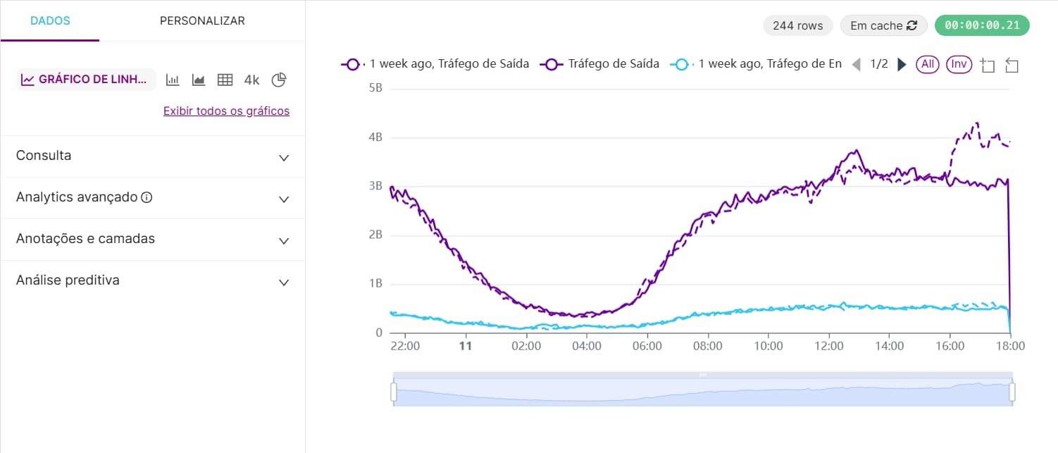
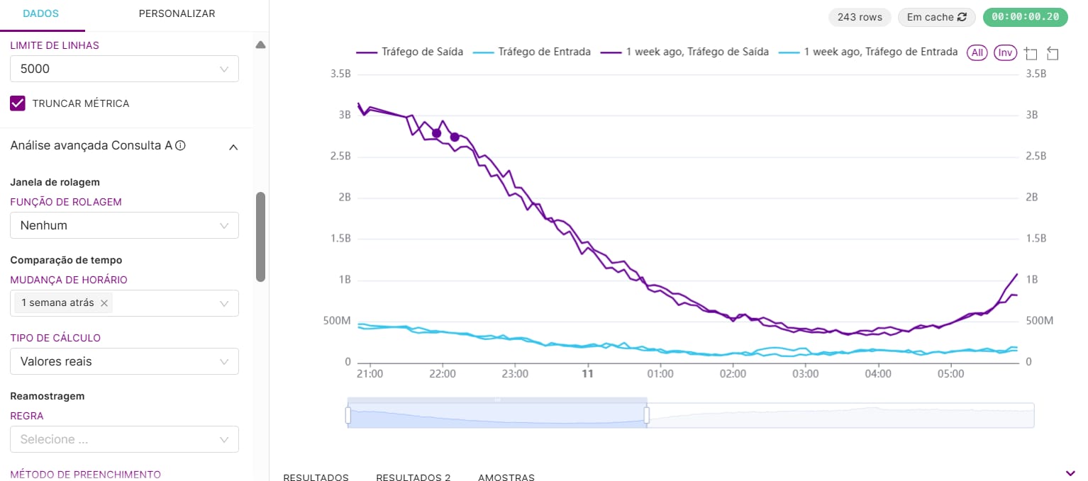
Bug description
As you create a mixed chart and use the time comparison function, it doesn't show the "1 week ago" lines dotted, it shows both lines filled. If you change it to a regular line chart, it will dot the time comparison line normally.
Screenshots/recordings
Superset version
master / latest-dev
Python version
I don't know
Node version
I don't know
Browser
Not applicable
Additional context
No response
Checklist
- [x] I have searched Superset docs and Slack and didn't find a solution to my problem.
- [x] I have searched the GitHub issue tracker and didn't find a similar bug report.
- [x] I have checked Superset's logs for errors and if I found a relevant Python stacktrace, I included it here as text in the "additional context" section.
Comment From: dosubot[bot]
This is a known gap in the current implementation: the mixed chart does not apply dotted or dashed line styles to time comparison ("derived") series, unlike the regular line chart. In the code, the line chart's transformation logic explicitly checks for time comparison series and assigns a dotted/dashed style, but the mixed chart's transformation code does not include this logic—so all lines, including time comparisons, appear solid by default. This isn't a documented limitation or a recent regression, but rather a missing feature in the mixed chart implementation. If you want to address this, the relevant code is in the transformProps functions for both chart types, and the logic from the line chart could be adapted for the mixed chart to achieve the expected styling behavior. For more details, see the implementation in the line chart's transformProps.ts and the mixed chart's transformProps.ts.
To reply, just mention @dosu.
How did I do? Good | Irrelevant | Incorrect | Verbose | Hallucination | Report 🐛 | Other 

Comment From: Vicinius
This is a gap that I would like to work on. But I would need some guidance on which files I'd have to change, and which (and where) implementation was made on the classic line chart
Comment From: dosubot[bot]
To implement time comparison (dotted/dashed) line styling in the mixed chart, you'll want to adapt the logic from the classic line chart's transformProps.ts file:
-
In the classic line chart, the relevant code is in
superset-frontend/plugins/plugin-chart-echarts/src/Timeseries/transformProps.ts. Here, each series is checked with theisDerivedSeriesutility, and if it's a time comparison (derived) series, alineStyle.type(dash/dot pattern) and opacity are set before passing totransformSeriesfor rendering. See the loop overrawSeriesfor the exact implementation and howlineStyleis constructed and passed in the options totransformSeries(source). -
In the mixed chart, the file to update is
superset-frontend/plugins/plugin-chart-echarts/src/MixedTimeseries/transformProps.ts. The loops overrawSeriesAandrawSeriesBcurrently do not check for derived series or assign a speciallineStyle(source). You can add similar logic as in the line chart: useisDerivedSeries(imported fromsuperset-ui-chart-controls/src/operators/utils/isDerivedSeries.ts) to detect time comparison series, then set alineStyle.type(e.g., dash/dot array) and pass it totransformSeries.
The utilities you need (isDerivedSeries and transformSeries) are already available and used in both chart types. After making the change, test by creating a mixed chart with time comparison enabled and verify that the derived lines appear dashed/dotted as expected.
To reply, just mention @dosu.
How did I do? Good | Irrelevant | Incorrect | Verbose | Hallucination | Report 🐛 | Other 
Comment From: Vicinius
I already have the fix for this. Did the implementation on the MixedTimeseries/transformProps.ts How can I create a pull request? Someone creates a branch for this feature? I fork the original repository and then some? This is the first time contributing to an open source project so I might need some guidance
Comment From: rusackas
Yep, you can for the repo, create a branch (or not, technically), and then open a pull request against master here on the origin repo. Feel free to hit me up on Superset Slack if you want to discuss.
Comment From: Vicinius
https://github.com/apache/superset/pull/34794 @rusackas PR opened! Thanks for your help