Screenshot
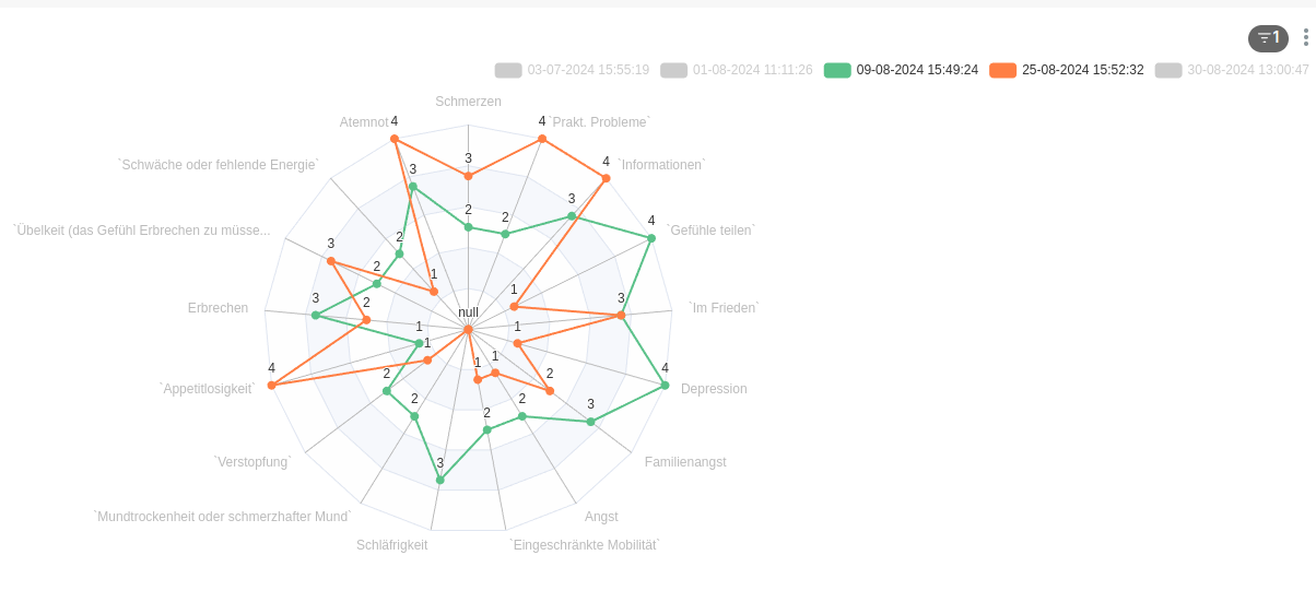
Description
If data contains a value of NULL, the chart visualizes as if the data has a value of 0. In the example above, a doctor cannot differentiate whether a patient did not answer a question, or checked an answer that would score to a 0 value.
Design input
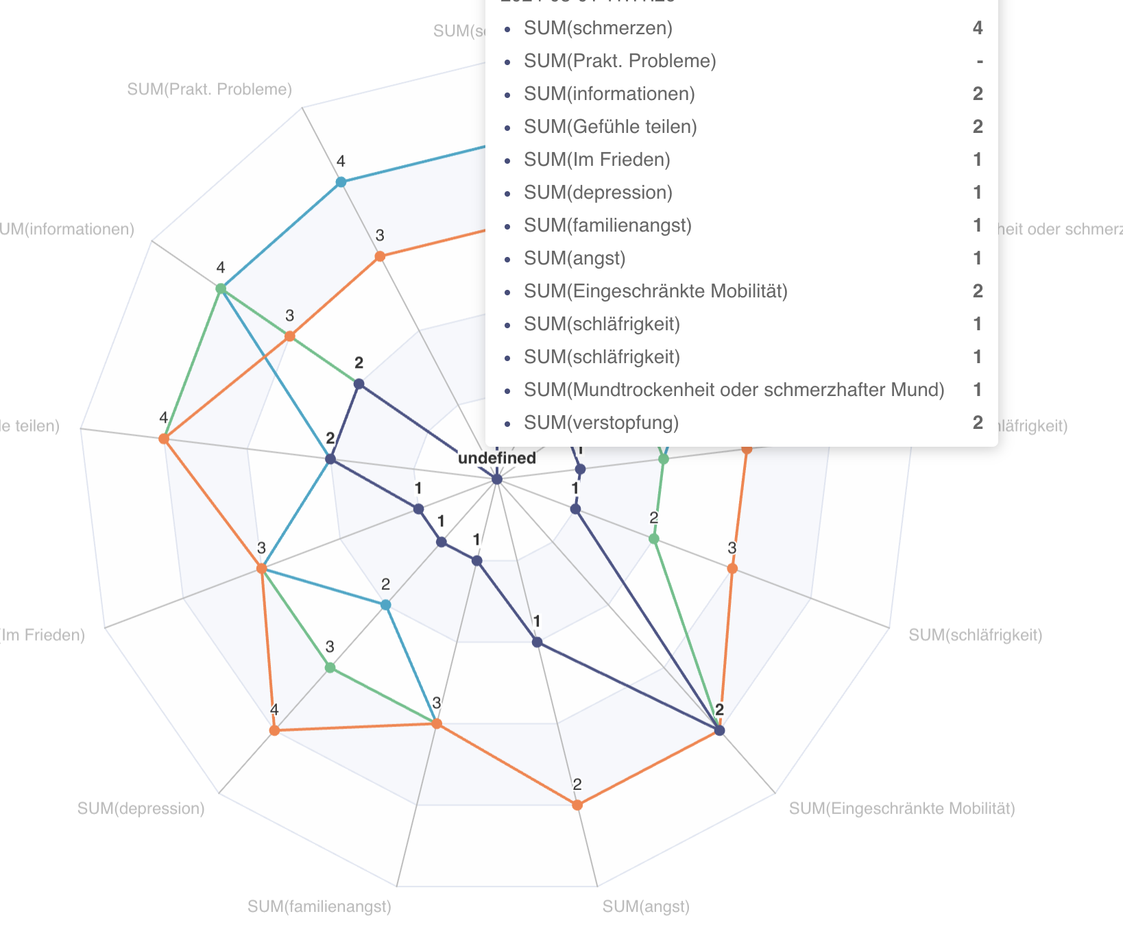
[design:suggest] Other tools creating radar charts do not draw a line to the axis containing the missing data point in case the data point is missing - which is an intuitive visualization of the data. Somewhat problematic is the visualization of an axis, when it's left and right adjacent axis are both containing NULL values. In this case, I suggest to draw a point only.
Comment From: dosubot[bot]
Hey @FrankTT3D! I'm here to help you with any bugs, questions, or contributions. Let's tackle this together!
To address the issue of radar charts incorrectly visualizing NULL values as 0, you need to modify the transformProps function to handle NULL values properly. Specifically, ensure that NULL values are not included in the value array for each data point. Here’s how you can do it:
data.forEach(datum => {
  const joinedName = extractGroupbyLabel({
    datum,
    groupby: groupbyLabels,
    coltypeMapping,
    timeFormatter: getTimeFormatter(dateFormat),
  });
  // map(joined_name: [columnLabel_1, columnLabel_2, ...])
  columnsLabelMap.set(
    joinedName,
    groupbyLabels.map(col => datum[col] as string),
  );

  // put max value of series into metricLabelAndMaxValueMap
  // eslint-disable-next-line no-restricted-syntax
  for (const [metricLabel, value] of Object.entries(datum)) {
    if (metricLabelAndMaxValueMap.has(metricLabel)) {
      metricLabelAndMaxValueMap.set(
        metricLabel,
        Math.max(
          value as number,
          ensureIsInt(
            metricLabelAndMaxValueMap.get(metricLabel),
            Number.MIN_SAFE_INTEGER,
          ),
        ),
      );
    } else {
      metricLabelAndMaxValueMap.set(metricLabel, value as number);
    }
  }

  const isFiltered =
    filterState.selectedValues &&
    !filterState.selectedValues.includes(joinedName);

  // generate transformedData
  transformedData.push({
    value: metricLabels.map(metricLabel => datum[metricLabel] !== null ? datum[metricLabel] : undefined),
    name: joinedName,
    itemStyle: {
      color: colorFn(joinedName, sliceId, colorScheme),
      opacity: isFiltered
        ? OpacityEnum.Transparent
        : OpacityEnum.NonTransparent,
    },
    lineStyle: {
      opacity: isFiltered
        ? OpacityEnum.SemiTransparent
        : OpacityEnum.NonTransparent,
    },
    label: {
      show: showLabels,
      position: labelPosition,
      formatter,
    },
  } as RadarSeriesDataItemOption);
});
This modification ensures that NULL values are replaced with undefined, preventing the radar chart from drawing a line to the axis containing the missing data point [1].
Additionally, there is an existing test for radar charts that include NULL values, which can help ensure your changes work correctly:
def test_pivot_df_complex_null_values():
    """
    Pivot table when a column, rows and 2 metrics are selected.
    """
    df = pd.DataFrame.from_dict(
        {
            "state": {
                0: None,
                1: None,
                2: None,
                3: None,
                4: None,
                5: None,
                6: None,
                7: None,
                8: None,
                9: None,
                10: None,
                11: None,
            },
            "gender": {
                0: "girl",
                1: "boy",
                2: "girl",
                3: "girl",
                4: "girl",
                5: "girl",
                6: "boy",
                7: "girl",
                8: "girl",
                9: "boy",
                10: "boy",
                11: "girl",
            },
            "name": {
                0: "Amy",
                1: "Edward",
                2: "Sophia",
                3: "Amy",
                4: "Cindy",
                5: "Dawn",
                6: "Edward",
                7: "Sophia",
                8: "Dawn",
                9: "Tony",
                10: "Tony",
                11: "Cindy",
            },
            "SUM(num)": {
                0: 45426,
                1: 31290,
                2: 18859,
                3: 14740,
                4: 14149,
                5: 11403,
                6: 9395,
                7: 7181,
                8: 5089,
                9: 3765,
                10: 2673,
                11: 1218,
            },
            "MAX(num)": {
                0: 2227,
                1: 1280,
                2: 2588,
                3: 854,
                4: 842,
                5: 1157,
                6: 389,
                7: 1187,
                8: 461,
                9: 598,
                10: 247,
                11: 217,
            },
        }
    )
    assert (
        df.to_markdown()
        == """
To continue talking to Dosu, mention @dosu.
Comment From: rusackas
@FrankTT3D would you be willing to try out the suggested fix (and open a PR if it works)? It seems like the real change the bot is suggesting is this bit:
     value: metricLabels.map(metricLabel =>
        datum[metricLabel] !== null ? datum[metricLabel] : undefined,
      ),
Comment From: rusackas
Not as simple as the @dosu-bot made it out to be. undefined still shows up in the middle.
Comment From: rusackas
Still open to PRs... or further investigation. Maybe @dosu has some additional ideas.
Comment From: dosubot[bot]
ECharts' radar series doesn't natively support breaking lines for missing/null values—setting values to undefined or null still draws a line to the center, which is why the previous approach didn't work. The only way to get the desired behavior (no line for missing data, or just a point if both neighbors are missing) is to preprocess the data in transformProps and use ECharts' 'custom' series type, which allows for per-segment rendering in polar coordinates. Superset already uses this approach for Gantt charts, so it's feasible to adapt it for radar charts as well.
This would involve splitting each series into contiguous non-null segments (each as a separate polyline), and rendering isolated points where needed. All of this logic would live in transformProps, since there are no per-point rendering hooks in the standard radar series. For reference, see how the Gantt chart plugin leverages the 'custom' series and renderItem for fine-grained control.
No PRs or docs currently address this for radar charts, but the architecture supports it at the ECharts config level right before rendering. If you want to prototype, start by segmenting your value arrays and building a 'custom' series config in transformProps—that will let you visually distinguish between zeros and missing data as described in your design input.
transformProps.ts
To reply, just mention @dosu.
How did I do? Good | Irrelevant | Incorrect | Verbose | Hallucination | Report 🐛 | Other 

