Screenshot
Description
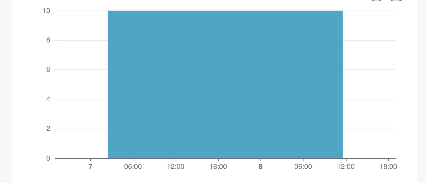
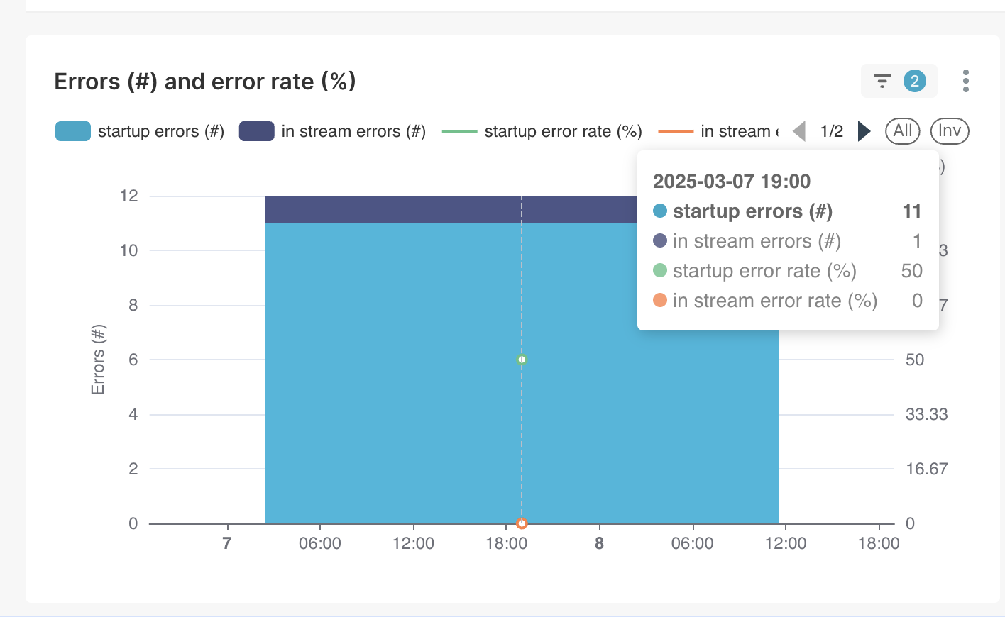
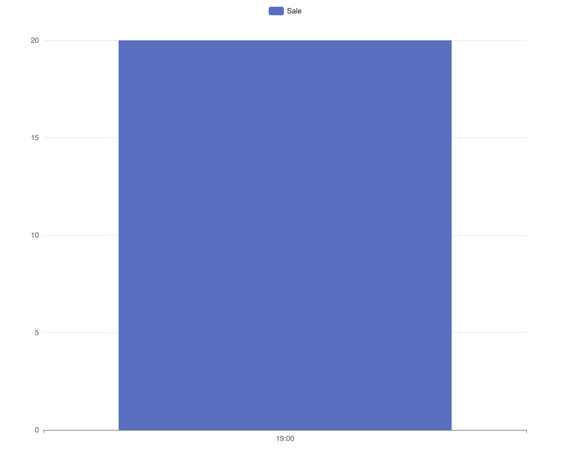
If there is only one single datapoint the bar gets too wide, it doesn't look nice and it can be confusing (as if there are multiple data points with the same value). When there are two data points or more this doesn't happen. My suggestion is to make the bar not wider than one 'tick' on the x-axis.
I'm seeing this on 4.1.1 on the regular bar charts and the mixed charts.
Comment From: rusackas
I'm on the fence of whether this should be considered a bug or a feature request :)
Either way, would you be willing to open a PR to address this? It's otherwise not super likely to get prioritized.
You might be able to investigate and open a fix? I'm guessing there's a sensible ECharts config option for this.
Comment From: araker
Hi @rusackas , thanks for the response. I was playing around with echarts and I think what is confusing me the most is that the lables on the x-axis don't change for that one data point. If there is only one data point I would expect only that label on the axis. E.g.
Comment From: rusackas
This is definitely still an issue, and we'd welcome a fix from anyone interested. I agree, it's confusing (I just ran into it myself).