Motivation
The src/components/ directory in Superset has grown into an unstructured mix of UI primitives, AntD wrappers, app-specific components, and deeply coupled logic. This creates several problems:
- Hard to reuse components in plugins, packages, and future SDKs. This forces
peerDependenciesonantd, which is suboptimal. Packages/plugins should NOT depend on the main app! - No clear boundary between reusable components and app-specific UI.
- Difficult navigation and discoverability due to inconsistent folder structures.
We propose to extract a clean, flat, reusable set of core UI components into a dedicated package, collocated with theming utilities, to better support modular development.
Proposed Change
We propose to:
- Create a new package:
@superset-ui/core/components
Collocated with:
@superset-ui/core/theme
- Move reusable components (especially AntD wrappers and UI primitives) from
src/components/into this package.
Criteria for inclusion:
- Component does not depend on app-specific logic (Redux, routes, etc.)
- Component wraps or styles base UI elements (AntD, styled-components, etc.)
- Component is likely to be reused across plugins, embedded apps, or external SDKs
- Leave app-specific components in
src/components/if they: - Import from other parts of the application (e.g.
src/views) -
Are unlikely to be useful outside the main app
-
Flat export structure:
All components and types are exported from a single unified namespace:
ts
   import { Button, Tabs, type TabsProps } from '@superset-ui/core/components';
We intentionally avoid nested folders like layout/Tabs or inputs/Button to keep things flat, discoverable, and easier to manage. If name collisions arise, we will handle them explicitly via namespacing. Tree specific DataNode becomes TreeDataNode for clarity and avoiding potential collisions.
- Initial integration via theming branch:
The Theming branch will lead this migration to minimize merge conflicts. Other efforts (e.g., plugin SDK) will coordinate to ensure parallel needs are addressed cleanly. We can coordinate with the Plugins / Extensions effort.
New or Changed Public Interfaces
- New package:
@superset-ui/core/components - New top-level exports for all reusable components and types
- Existing imports from
src/componentswill be migrated to the new namespace as part of the rollout - Internal theming APIs from
@superset-ui/core/themewill become shared as part of this effort
New dependencies
No new dependencies expected initially. If any are introduced (e.g., utility libraries or a component doc generator), they will be actively maintained and Apache-compatible.
Other Superset packages in the ecosystem should not import antd directly, they should always use primitives from @superset-ui/core/components. When creating new native components, they are in charge of making those new components themable, ideally by building upon the antd-inherited components in the package.
Migration Plan and Compatibility
- Migration will happen incrementally, led by the Theming branch. The best approach is likely to move the app-specific components (with Redux-type interaction, or importing components from outside
src/components, ...) will be moved out of src/components, and a big replace-in-files will tackle the reassignment. - Existing files in
src/componentswill be removed only after successful integration and usage from the new package - Imports within Superset will be updated to use the new
@superset-ui/core/componentspaths - We may introduce codemods or linting rules to help enforce import consistency
- New package builds and publication to
npmwill take place upon merging the Theming branch - alter/adapt the react-storybook(s) to point to this new package. We may want to ship a
superset-ui/core-specific storybook that we can compose-into the main app's storybook
Rejected Alternatives
- Keep everything in
src/components/: Doesn’t support modularity or reuse - Introduce deep subfolder organization: Adds cognitive overhead and slows down navigation, especially in a large shared UI package
- Split theming and components into separate packages: These two concerns are tightly coupled and should evolve together, at least for now
Comment From: amaannawab923
True This is a well-structured and thoughtful proposal that addresses real pain points in Superset’s UI architecture.
Extracting reusable, themable components into @superset-ui/core/components will make it easier to maintain . The flat export structure promotes discoverability and simplicity, and the inclusion criteria are pragmatic. Coordinating the migration via the Theming branch is smart, minimizing disruption. Overall, this change is a strong step toward a cleaner, more scalable frontend foundation, especially valuable for plugins, embedded apps, and future SDKs.
Currently we have a very tight dependancy on Antd and we have to construct components keeping antd in mind , this might help break that dependancy
@mistercrunch
Comment From: michael-s-molina
@mistercrunch Let's schedule a meeting to align this proposal with the work being made in the extensions project.
Comment From: mistercrunch
Totally worth meeting over this. Hoping you all haven't done too much already in this area since the Theming branch is heavily altering src/components and resolving merge conflicts would probably be hopeless.
Comment From: rusackas
My main head-scratcher here is about why we would want to stick more stuff in /core at all. I'd rather just have new packages, e.g. @superset-ui/components and @superset-ui/themes then they can be better versioned with SemVer.
Comment From: mistercrunch
Trying my hand at Mermaid for high-level package modeling, just food for thoughts. Also wondering how core should be structured, knowing that we need a shared place for the app and the sdk to source from.
graph TD
  subgraph core["Shared Primitives"]
    subgraph ui["UI"]
      components["components"]
      theme["theme"]
    end
    utils["utils"]
    misc["misc"]
  end

  app["Superset Frontend App"] --> core
  sdk["Extension SDK"] --> core
  storybook["React Storybook"] --> core

  docs["Superset Docs"] --> app
  docs --> storybook

  sdk_docs["SDK Docs"] --> sdk
  sdk_docs --> storybook
Comment From: mistercrunch
About all this and the recent community meeting, I worked with GPT at producing this ->
On Shared Primitives and API Boundaries
Following a recent community meeting, an important question came up around how we structure our frontend packages — specifically, which packages should exist, how they depend on each other, and what should be labeled as public vs private.
One of the key debates was around the bucket of shared primitives — a collection of utility functions, components, types, and hooks that are used across the Superset app and SDKs.
Here, I’ll make the case that this shared primitives package should be treated as private, and that each SDK should be in charge of deciding: - which primitives it wants to use internally, and - which it chooses to expose publicly as part of its API.
Why shared ≠ public
Just because a function or component is reused doesn't mean it should be exposed.
Making all shared primitives public: - Bloats the API surface — every internal helper becomes part of the public contract. - Creates upgrade friction — a breaking change in a low-level primitive could break all SDKs that import it directly. - Encourages misuse — consumers may depend on primitives not meant for external use. - Makes versioning harder — users can't easily tell which version of the primitives is compatible with which version of the SDK.
A better model: SDKs as curators
- Each SDK should act as a curated public interface, exposing only what it wants to support and maintain.
- Internally, SDKs are free to use any primitive from the shared package.
- Each SDK declares which version of the primitives it depends on.
- In the case of the extension SDK, it can also declare which app version(s) it’s compatible with.
This keeps each SDK self-standing, with clear boundaries and better long-term maintainability.
Examples of shared-but-private code
These are good candidates to share internally, but not expose:
- Utility functions like formatTimeRange, parseSqlExpression, isFeatureEnabled
- Low-level UI components like <Space />, <Timer />, <PermissionGate />
- Internal hooks like useDebouncedValue, usePrevious
These are useful building blocks for the app and SDKs, but they’re not meant to be part of the public API surface.
Final Thoughts
Let’s make sure we’re building modular, maintainable packages — not a sprawling framework. Shared primitives should power our ecosystem, but SDKs should be the ones deciding what’s public.
Keep the internals flexible. Keep the public APIs tight.
Comment From: mistercrunch
Did a quick review of how other extensible platforms structure this kind of thing:
How it's handled in other ecosystems:
- iOS (Apple frameworks):
- Tons of shared internal APIs and components, but only a curated set is made public.
- SDKs are self-contained. Public APIs are documented, versioned, and stable.
-
Internal code evolves freely without exposing churn to SDK users.
-
Android (Jetpack/AOSP):
- Separates
*.internalpackages from public APIs. - Public surface is curated and follows strict API review processes.
-
Individual SDKs/libraries are self-contained and versioned independently.
-
VS Code (extension platform):
- Core uses shared primitives internally, but only exposes a controlled API via the
vscodemodule. - Extensions rely only on that documented interface — no access to internals.
- Public API surface is semver-managed and backward compatible.
Takeaway:
Internal reuse is common. Public exposure is deliberate and minimal.
Each SDK should curate its own public API, and shared primitives should remain internal unless there's a strong reason to promote them.
This strengthens the case that shared ≠ public, and that SDKs should act as intentional gatekeepers, just like in mature platforms.
Comment From: michael-s-molina
Thank you for the discussion and additional research @mistercrunch. Writing our thoughts might be helpful to get to the best solution. In order for me to understand your proposal, I'll add some details and ask some questions. I'll start with what was the model that we were thinking in the extensions project and try to understand how that would change with your proposal.
Our initial thinking was that we would have separate packages for public, private, and SDKs:
@apache-superset/primitiveswould contain the shared components/functions that are public, or in other words, that can be used by extensions and need to be versioned. One example here would be theButtoncomponent.@apache-superset/extensions-sdkwould contain functions that are used to build, bundle, and publish extensions to Superset. It would also contain a testing framework to help unit test extensions without the host application.- Private functions and components like the ones you mentioned would not be included in
@apache-superset/primitivesand would reside in another package inside Superset.
An extension would have a production dependency on @apache-superset/primitives:
import { Button } from '@apache-superset/primitives';
and a dev-dependency (not production) on @apache-superset/extensions-sdk to run the following commands:
superset-sdk build
superset-sdk bundle
superset-sdk test
...
Superset would also have a dependency on @apache-superset/primitives, no dependency on the SDK, and follow the same pattern as extensions:
import { Button } from '@apache-superset/primitives';
If any other project would like to use the components available in @apache-superset/primitives, they could just add them as a dependency. One example, would be a host application that embeds Superset and wants to use the same button styles in the host part to match the design.
Now, I'll try to port these abstractions to your proposal to see if I'm understanding correctly. Only assumptions and questions from now on 😄
- When you say that the SDKs should be gate keepers for the public parts, do both packages exist? If yes, how that would work?
@apache-superset/extensions-sdk
@apache-superset/primitives
Or is the primitives package a sub-folder of the SDK? Or something else?
@apache-superset/extensions-sdk
- primitives (sub-folder)
- If it's the sub-folder approach, how does Superset import the primitives? I'm assuming we don't want something like
import { Button } from '@apache-superset/extension-sdk';
in the host application, only in extensions.
- How do we reuse the primitives with other SDKs and applications?
- Are you thinking of a layer of abstraction like
Buttoninterfaces that belong in the SDK but the implementation is in a private part?
Comment From: mistercrunch
Seems like we're pretty aligned, we all agree that we need a package with a full set of "shared primitives", now the question is whether SDKs are in charge of re-publishing a subset of these primitives, or whether SDKs are expected to work in conjunction with a primitives public package.
I guess you could call that package the "primitives SDKs" and it's effectively the same idea, except that it's expected that people would typically combine their main use case SDK with the "primitives SDK".
Trying to graph out two potential approaches that are slightly different ->
SDKs publish a subset of primitives
graph TD

  subgraph private["Private (shared primitives)"]
    theme["theme"]
    components
    utils
  end

subgraph external["External apps"]
    app1
    app2
    app3
  end

  subgraph public["Public"]
    chartSDK["@superset/chart-sdk"]
    embedSDK["@superset/embed-sdk"]
    extensionSDK["@superset/extension-sdk"]
  end

  public --> private

  app1 --> embedSDK

  app2 --> extensionSDK

  app3 --> chartSDK


  superset["Superset Frontend App"] --> private
Apps mix and match SDKs with a public primitives bundle
vs
graph TD

  subgraph private["Private (shared primitives)"]
    theme["theme"]
    components
    utils
  end

subgraph external["External apps"]
    app1
    app2
    app3
  end

  subgraph public["Public"]
    chartSDK["@superset/chart-sdk"]
    embedSDK["@superset/embed-sdk"]
    extensionSDK["@superset/extension-sdk"]
    primitives
  end

  public --> private

  app1 --> embedSDK
  app1 --> primitives

  app2 --> extensionSDK
  app2 --> primitives
  app3 --> chartSDK
    app3 --> primitives


  superset["Superset Frontend App"] --> private
I think personally I prefer the idea of "self-contained SDKs", but it depends on whether most SDKs will bundle most of the primitives or not.
Comment From: mistercrunch
Thinking more in terms of frontend package architecture and how it could be structured ...
flowchart TD

  %% External apps
  third_party["3rd Party Apps"]

  %% Superset Monorepo container
  subgraph superset_repo["Superset Repo"]
    direction TB

    superset["superset-frontend/"]

    subgraph Public ["Public"]
      direction TB

      subgraph sdks ["SDKs"]
        direction TB
        sdk1["sdk-embed/"]
        sdk2["sdk-visualization/"]
      end
    end

    subgraph Private ["Private"]
      direction TB

      core["superset-ui/core/"]

      subgraph plugins ["Plugins"]
        direction TB
        plugin_echarts["plugin-chart-echarts/"]
        plugin_table["plugin-chart-table/"]
        plugin_more["..."]
      end

      controls["superset-ui-chart/controls/"]
      switchboard["superset-ui-switchboard/"]
    end

    %% Internal app dependencies
    superset --> core
    superset --> controls
    superset --> plugins
    superset --> sdks
    superset --> switchboard

    %% SDK and internal deps
    sdks --> core
    plugins --> core
    controls --> core
    switchboard --> core
  end

  %% External usage
  third_party --> sdks
Comment From: mistercrunch
flowchart TD

  %% External apps
  third_party["🌐 Apps embedding Superset"]

  %% Superset Monorepo container
  subgraph superset_repo["🧱 Superset Repo"]
    direction TB

    core["🧠 Core (superset-ui/core"]
    superset["🧩 superset-frontend"]

    subgraph sdk["🧰 SDKs"]
      direction TB
      sdk_embed["sdk-embed/"]
      sdk_extensions["sdk-extensions/"]
      sdk_plugin["sdk-plugin/"]
    end

    subgraph core_ext["🧩 Core Extensions"]
      direction TB
      ext_sql_lab["extension-sql-lab-AI"]
      ext_more["..."]
    end

    subgraph core_plugins["📊 Core Plugins"]
      direction TB
      plugin_echarts["plugin-chart-echarts/"]
      plugin_table["plugin-chart-table/"]
      plugin_more["..."]
    end

    %% internal deps
    superset --> core
    superset --> sdk
    superset --> core_ext
    superset --> core_plugins

    core_ext --> core
    core_ext --> sdk_extensions

    core_plugins --> core
    core_plugins --> sdk_plugin

    sdk --> core
  end

  %% External resources
  subgraph external_resources["🔌 External Superset Resources"]
    direction TB

    ext_plugins["📊 External Plugins"]
    ext_extensions["🧩 External Extensions"]

    ext_plugins --> sdk_plugin
    ext_extensions --> sdk_extensions
  end

  %% Customized deployment
  custom_deployment["🏗️ Customized Superset Deployment"]
  custom_deployment --> superset
  custom_deployment --> ext_plugins
  custom_deployment --> ext_extensions
  third_party --> custom_deployment
  third_party --> superset
  %% External usage
  third_party --> sdk_embed
longer term view collage ...
Comment From: michael-s-molina
Hi @mistercrunch. We have been discussing this actively in the context of extensions. We analyzed the following platforms to understand how they deal with package organization in the context of extensions:
| SDK/Ecosystem | Description |
|---|---|
| Android | Official toolkit for building Android apps, including APIs, UI widgets, tools, and emulators. |
| Shopify | Tools and APIs for building Shopify apps and extensions. |
| Firebase | APIs and tools for integrating Firebase services (auth, database, etc.) into apps. |
| Stripe | APIs for payment processing. |
| Microsoft Graph | APIs and types for accessing Microsoft Graph (Office 365, Azure AD, etc.). |
| Twilio | APIs for SMS, voice, and other communications. |
| Slack | APIs and types for building Slack apps and bots. |
| VS Code Extensions | APIs for building VS Code extensions. |
| Atlassian Forge | SDK for building Jira/Confluence cloud apps. |
| Figma | APIs and types for building Figma plugins. |
| Notion | APIs for integrating with Notion. |
Key Takeaways:
- The term “SDK” is often used to describe the overall toolkit or collection of resources for development, not necessarily a single package.
- Many platforms split their SDK into multiple focused packages (e.g., APIs, types, UI, CLI), rather than bundling everything into a single
-sdk package. - Sometimes there is a package named
-sdk, but it usually serves as an entry point or meta-package, while the actual functionality is distributed across several specialized packages.
One example of a meta package is the Firebase package which has the following package.json:
"dependencies": {
    "@firebase/ai": "1.3.0",
    "@firebase/app": "0.13.0",
    "@firebase/app-compat": "0.4.0",
    "@firebase/app-types": "0.9.3",
    "@firebase/auth": "1.10.6",
    "@firebase/auth-compat": "0.5.26",
    "@firebase/data-connect": "0.3.9",
    "@firebase/database": "1.0.19",
    "@firebase/database-compat": "2.0.10",
    "@firebase/firestore": "4.7.16",
    "@firebase/firestore-compat": "0.3.51",
    "@firebase/functions": "0.12.8",
    "@firebase/functions-compat": "0.3.25",
    "@firebase/installations": "0.6.17",
    "@firebase/installations-compat": "0.2.17",
    "@firebase/messaging": "0.12.21",
    "@firebase/messaging-compat": "0.2.21",
    "@firebase/storage": "0.13.12",
    "@firebase/storage-compat": "0.3.22",
    "@firebase/performance": "0.7.6",
    "@firebase/performance-compat": "0.2.19",
    "@firebase/remote-config": "0.6.4",
    "@firebase/remote-config-compat": "0.2.17",
    "@firebase/analytics": "0.10.16",
    "@firebase/analytics-compat": "0.2.22",
    "@firebase/app-check": "0.10.0",
    "@firebase/app-check-compat": "0.3.25",
    "@firebase/util": "1.12.0"
},
In the extensions project, we currently have @apache-superset/core as the only frontend dependency for extensions. We might have another one called @apache-superset/extensions-testing in the future as an optional development dependency.
@villebro pointed out that the meta package is a valid approach but will be an overkill for a single dependency. We opted for not creating a meta package initially given the small number of dependencies we have. At the same time, if the number of dependencies increase due to new features or refactoring of the core package, we'll create a meta package similar to what Firebase does.
We took your images above and created a proposal for keeping this SIP aligned with the extensions work.
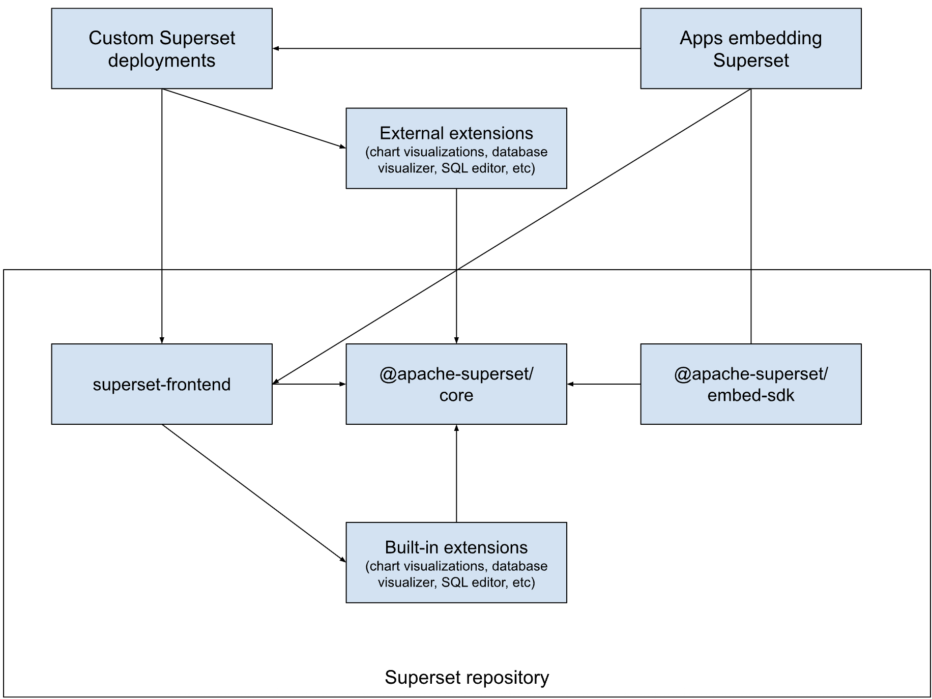
The only differences are:
- We consider plugins as extensions. They will be a specific contribution type.
- Both built-in and external extensions depend on the @apache-superset/core package.
I believe the rest is similar to your suggestion.
@villebro Let us know if I missed anything from our discussion.
Comment From: mistercrunch
Reporting back from the Theming branch (https://github.com/apache/superset/pull/31590) where I moved the majority of src/components/* to (for now) @superset-ui/core/components. Some components in there were tangled up with src/ for good reasons and remained there as they are more of an app-construct, and some were tangled up for bad reasons and I tried to untangle most of those and move them to core/, at least for now.
The branch's main focus was the antd-v5 migration, which is complete within that branch, with lots of great side missions like:
- getting rid of all the .less files and general .less support in the repo
- getting rid of font-awesome in favor of antd's icon package
- plugins now rely on @superset-ui/core/components for base components instead of a peerDep on antd
- killed bootstrap (!)
- most (all?) FAB CRUD gone
- all themed, there's a PR to bring in an app-level ThemeController in charge of managing themes (retrieve, save, inject, ...)
- some tsconfig refactoring, with just a bit of inheritance (ts.base.config.json) for some consistency across the codebase
I generally tried to get rid of default exports (still some work to do) and to bring components flat into that main namespace, which should make things much easier to move components again if/when we decide so.
It'll be good to chat about all this, but doing this work it seemed like a plugin-sdk as a common basis on top of core to support plugins (internal and external) would make a lot of sense.
Generally cleaning up core/ would be great, where things like chart-controls/ clearly are a plugin-sdk-type construct, and many packages seem like they don't have a clear function (or maybe I just don't get it) -> superset-ui-switchboard/ ? superset-ui-demo/ ?
After months of refactoring, it feels there's hope there, including to wrap up long-standing refactor like the ts-migration (looking at you airbnb/ts-migrate) and Enzyme -> rtl.
As to final the target final state I don't care too much one way or another, but feels right to have all the foundational bits (anything used across sdks and the main app) in a private place, directly linked to the app in the main repo. One big question is whether we clean in-place directly in core/, or in a new area say primitives/ package with the goal of deprecating core over time (?)
Comment From: villebro
@mistercrunch we want to make sure the new @apache-superset packages are super clean to avoid unnecessary breaking changes. So if there's any contention in the migrations I suggest first migrating them to superset-ui/core, and later moving them to @apache-superset/core (we intend to ultimately kill all @superset-ui packages). But if we're all clear on the migration, I don't see any reason not to move them directly to @apache-superset/core.
Comment From: mistercrunch
I think we all agree there's a need to have a bucket of components/utils/frameworks shared across the ecosystem of packages and use cases (main app, plugins, extensions, embed). Today that package is pretty much core/ and chart-controls/. If you unpack what's in there today you env up roughly with this list:
- things required to build viz plugins
- utility functions shared across plugins/packages/main-app
- peerDeps generally reused in plugins/extensions
- some test utils
- chart components to do react native "embeds"
- failed or semi-failed experiments (dynamic plugins, chart-oriented storybook)
Now we have the option to clean/refactor core/ or start over on a new name and carefully migrate things from core/ to that new package. I think I could be convinced in either approach, but generally hate multi-year transitions. Why not cleaning up core and making it what it needs to become (?)
Comment From: mistercrunch
Also did some more thinking on the public/private segmentation and semver implications, but thinking that if we were to take what's in core today, clean the crap out of it, clarify the public/private intersection, and do proper semver packaging, that one package could fulfill the vision to support all external use cases (viz plugins, extensions, chart-embed, ...)
Comment From: michael-s-molina
Also did some more thinking on the public/private segmentation and semver implications, but thinking that if we were to take what's in core today, clean the crap out of it, clarify the public/private intersection, and do proper semver packaging, that one package could fulfill the vision to support all external use cases (viz plugins, extensions, chart-embed, ...)
This is exactly the same conclusion we had. We named this package @apache-superset/core because it does not only include UI elements but also utility functions, APIs, types, etc. Our thinking was to start a fresh package and move the vetted components from the existing packages to it, which would avoid crap and clarify the public/private intersection as you mentioned. In the end, @superset-ui packages would be removed, public things would be consolidated into @apache-superset/core, and private things would be organized into other non-public packages.
Why not cleaning up core and making it what it needs to become (?)
Given that we need to rename the package anyway, we thought that starting a new package would give us the opportunity to carefully review the components before moving them and also to think about its general organization. I'm not opposed to do the inverse where we rename @superset-ui/core to @apache-superset/core and remove things from it. In the extensions project, we are opting to introduce new packages to prevent the inheritance of past structures and their associated drawbacks.
Comment From: mistercrunch
Post conversation yesterday, I believe we agreed in many things there:
- @apache-superset/core becomes the new, clean, official foundation for assets that are shared between the main app
- @superset-ui/core remains for the time being, and becomes largely private and unsupported for non-supserset-official packages
- some things to get migrated from @superset-ui/core to @apache-superset/core, like components/ + theming/ for instance. Maybe more of the clean/settled bits
- new identified need to provide a fully typed REST API client as part of @apache-superset/core, something generated based on openapi spec the backend is providing. SupersetClient in @superset-ui/core likely to get phased-out and replaced by that
- still a need to refactor/improve @apache-superset/core, in some cases as a path to migration to the settled API in @apache-superset/core. Say the utils lib could be cleaned up and improved in the old package, and when it's clean and settled enough we move to the new package
Comment From: villebro
@mistercrunch thanks for the summary. I think we're highly aligned 👍 I think the SupersetClient topic might still need some more discussion (I have some thoughts on this), but in general, I think this aligns well with the extension work.
Comment From: michael-s-molina
Agreed! Thanks for the discussions!
Comment From: mistercrunch
GPT recommends -> https://github.com/hey-api/openapi-ts
I didn't go as far as installing / running it, but from my understanding, generating a fully typed TS client from a proper openapi spec (like I'm pretty sure we have across the REST API) should be mostly deterministic and work out of the box, short of hooking up the prefix-url and maybe some auth-stuff.
Now the difficult part is ripping out all of our code that uses the current SupersetClient and/or fetch directly and using this instead. Would lead to a lot of type safety that would be fully synced with the backend ❤ ❤ ❤ .
I'd say the @apache-superset/core package could start clean with this, and we'd refactor the main app to use this in place of whatever else it's doing RN. Let's hope AGI is around the corner and can take on this task.
Comment From: michael-s-molina
@mistercrunch I think we're ready to submit this SIP to a vote.
Comment From: mistercrunch
Could probably close as it's not controversial and the work has been incorporated in the Theming branch. What do you think?
Comment From: michael-s-molina
That works for me! I'll reference this SIP from the Extensions SIP as the discussion was really valuable and provides a lot of great context.
Comment From: rusackas
Agreed this is not controversial, and doesn't seem like a breaking change, so long as it's covered in UPDATING.md. Feel free to close this and mark it as "abandoned" on the project board if you do.
Comment From: mistercrunch
Lazy consensus achieved. Closing.
Comment From: rusackas
@mistercrunch I didn't see a thread for Lazy Consensus on the dev@ list... was this already implemented, or should we back up and get consensus here? I'm by no means against it and happy to throw a +1 at it by VOTE or by Laziness.
Comment From: mistercrunch
Pretty much done already, moved the components to @superset-ui/core/components and they're pretty much flat, might be a bit more flattening to do