Motivation Creating a chart in Superset currently requires users to go through the full Explore workflow. This process is powerful, but can be cumbersome for casual users or embedded use cases where speed and simplicity are paramount.
There is growing interest in enabling more intuitive, lightweight ways to create and modify charts directly within a dashboard. Alot of people would agree on support for:
Embedding single charts with limited interactivity
Allowing some level of the Explore experience within a dashboard
Supporting inline chart creation for faster prototyping
The “Easy Charts” concept addresses these needs by enabling users to create simple, metric-driven charts directly within a dashboard, using an embedded popover with limited controls.
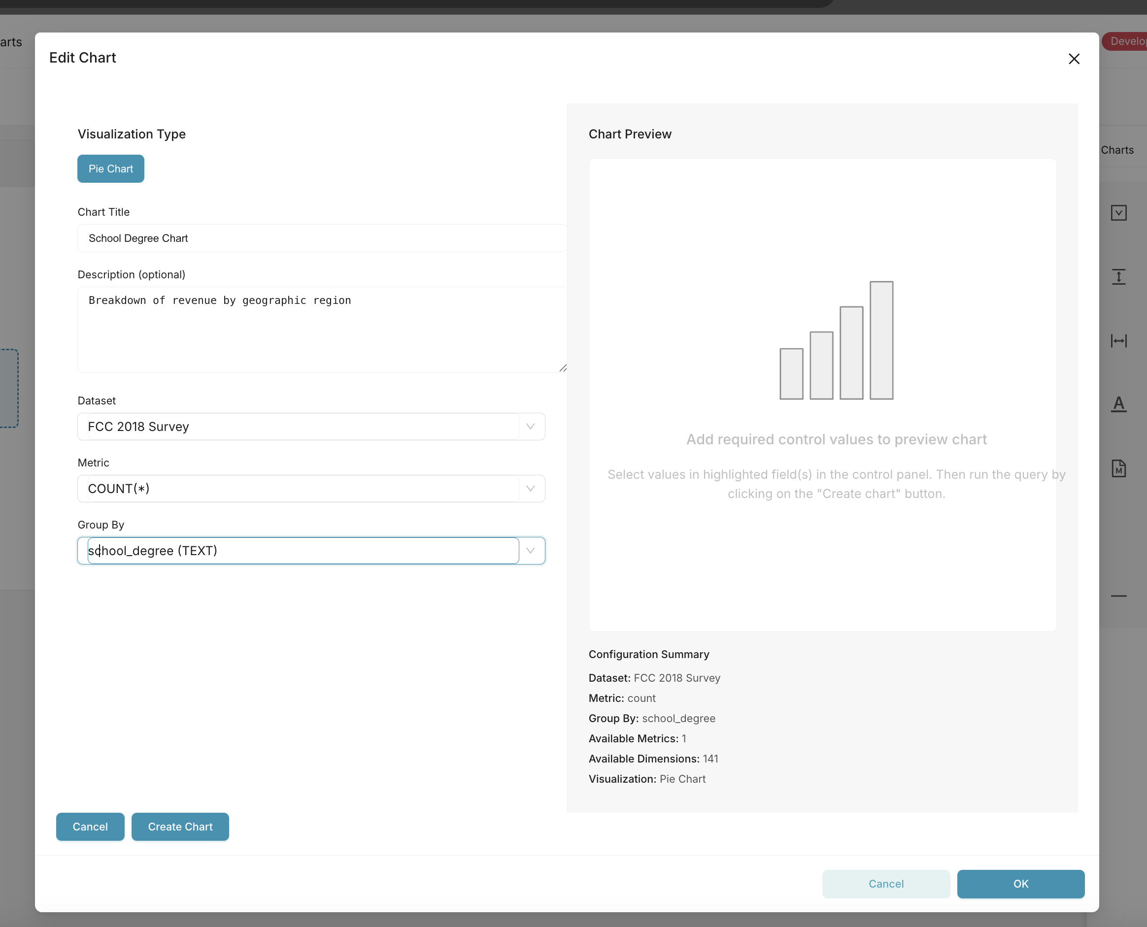
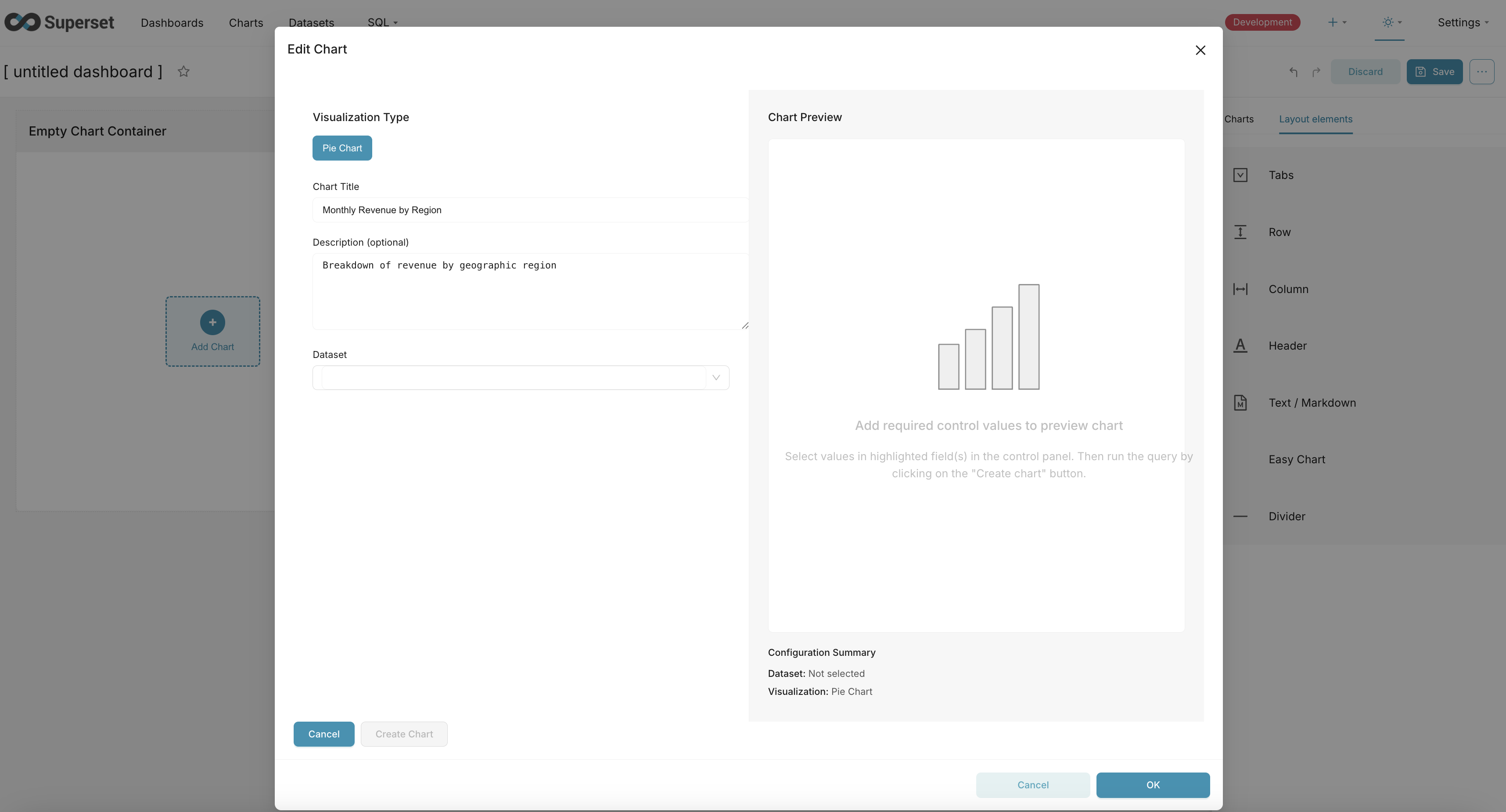
Proposed Change We propose to introduce an Easy Charts feature into dashboards, allowing users to quickly insert and configure simple charts without leaving the dashboard context , it will be a dashboard layout components along the lines of row , column & markup .
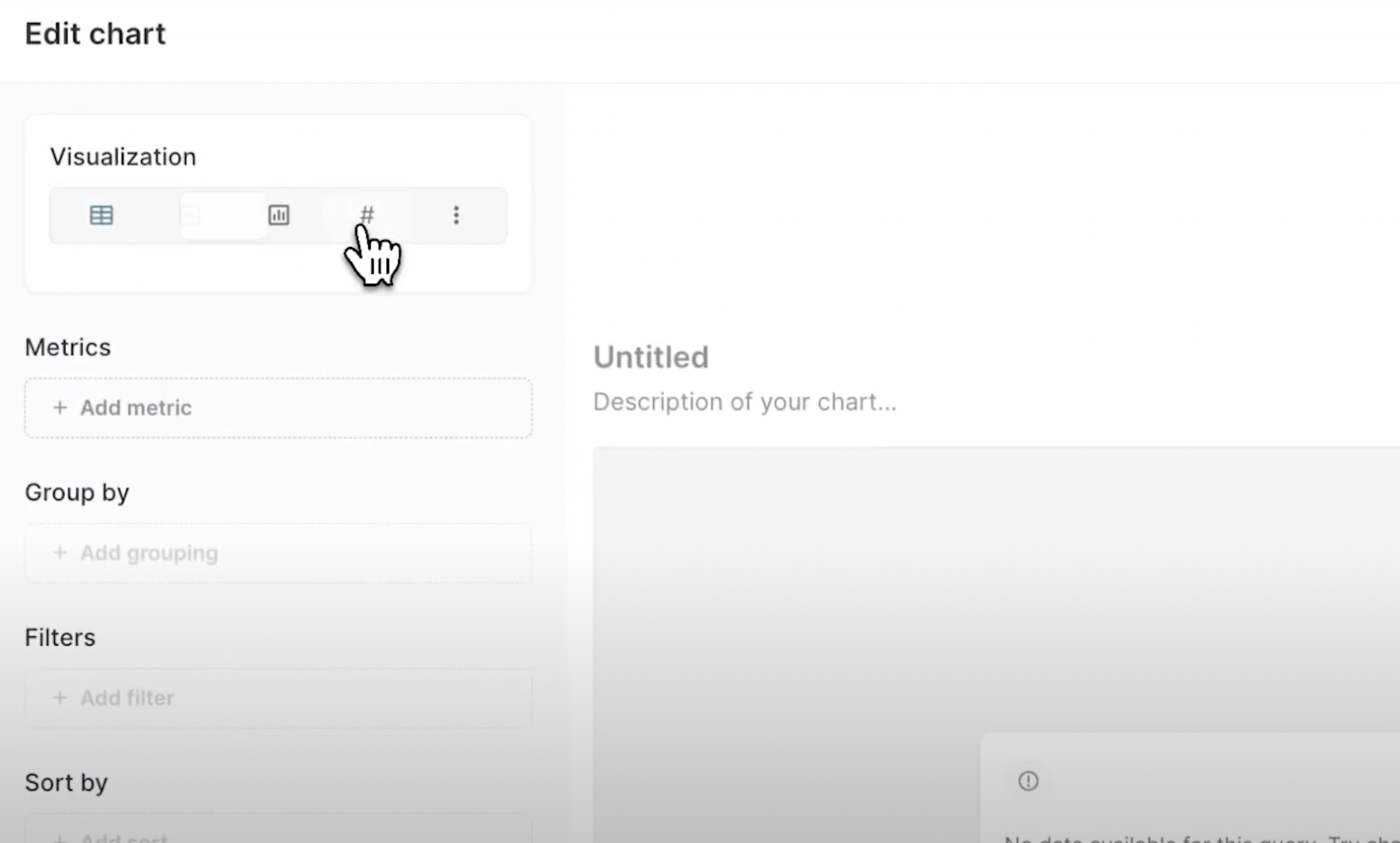
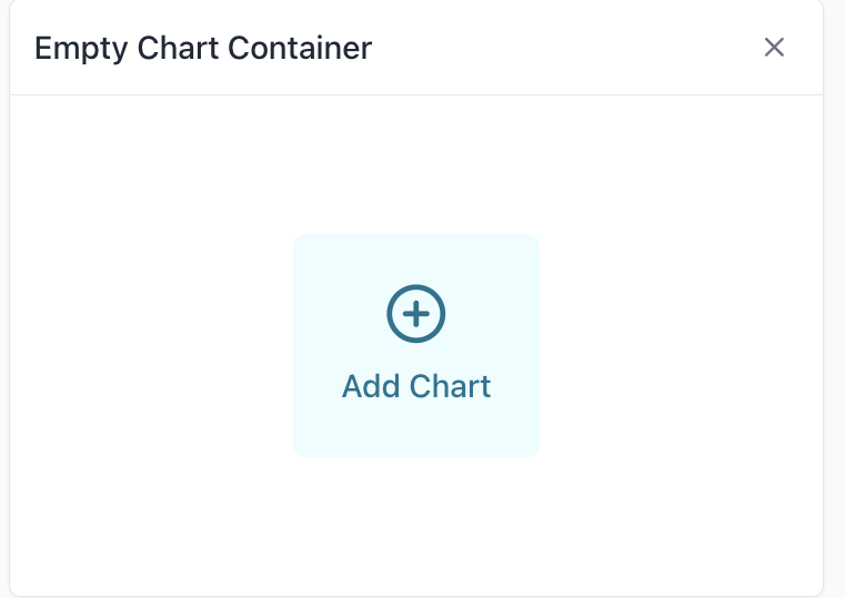
UX Flow User adds a new chart placeholder to a dashboard grid — an empty chart container with a + Add Chart button.
Clicking the button opens a popover chart builder UI with minimal controls:
Dataset selector
Visualization type selector (top bar)
Metric selector
GroupBy selector
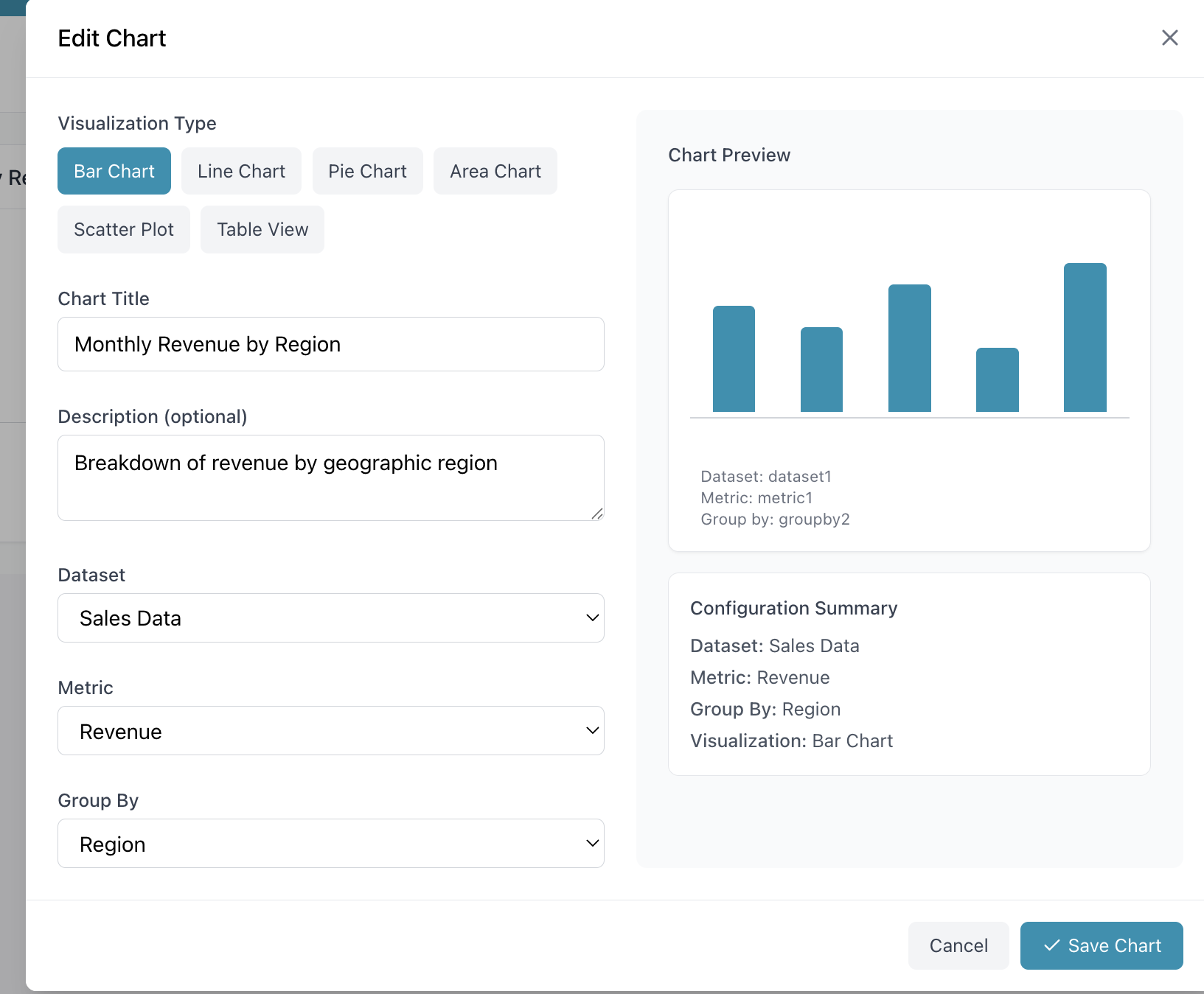
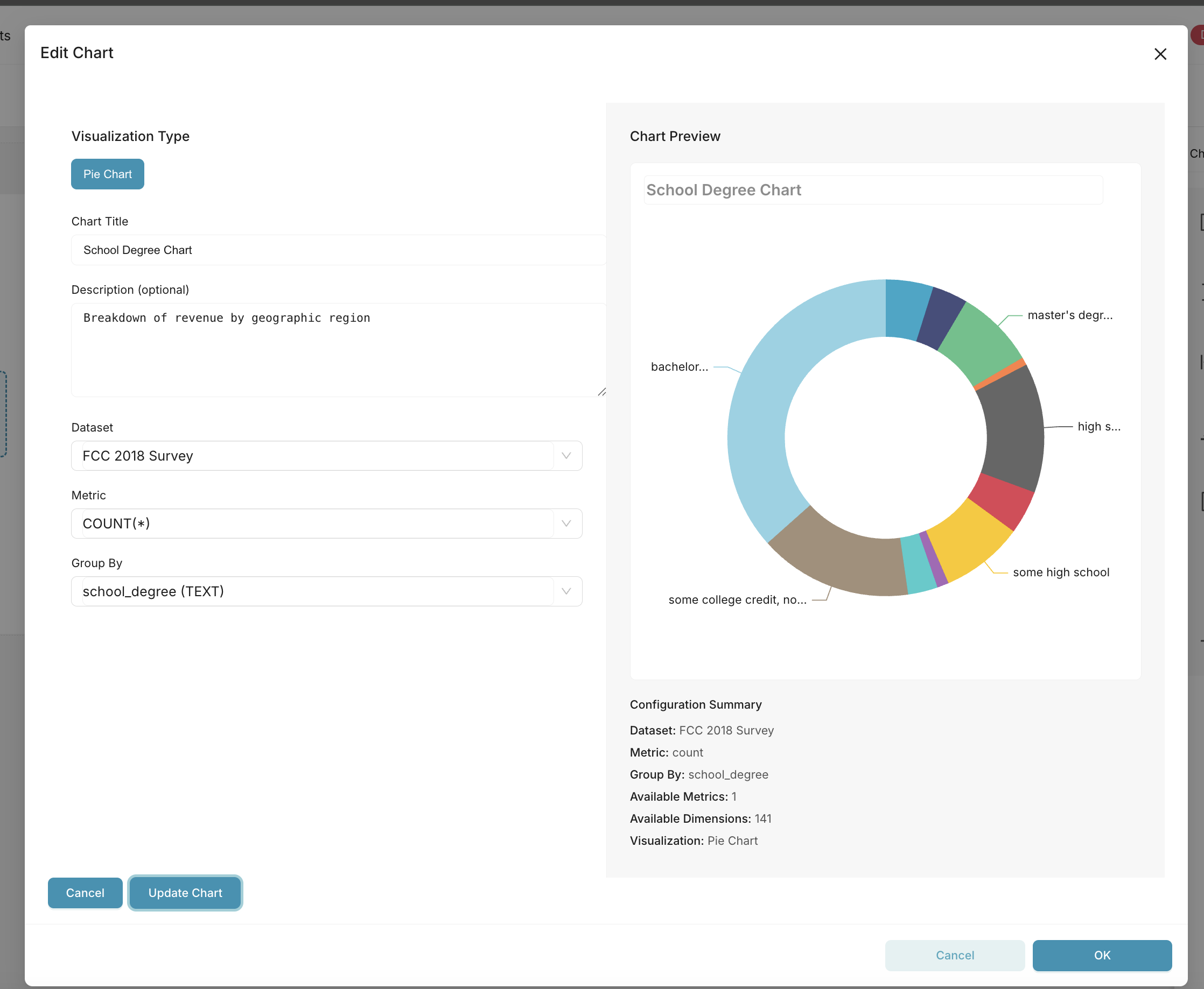
Upon saving:
A new chart (slice) is saved to the backend
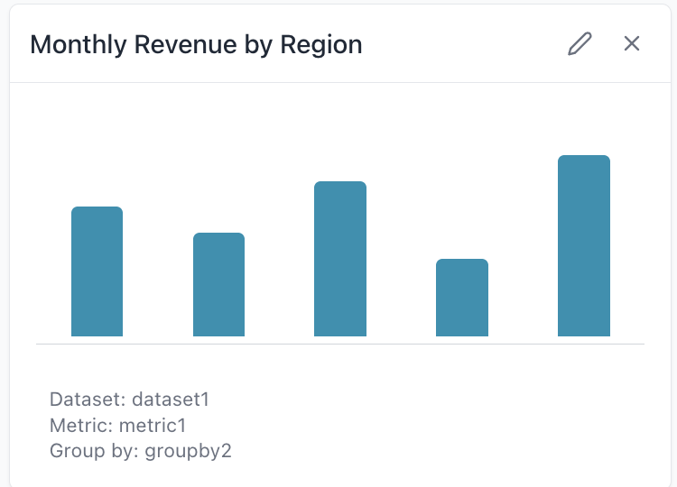
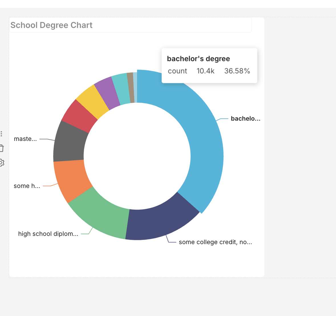
The chart renders inside the container
The chart can later be opened in full Explore for advanced editing
Optional: the chart container supports lightweight re-editing or swapping metrics/groupby values inline
Criteria for Inclusion Must work within dashboard edit mode
Minimal dependencies on Explore — avoid Redux and route-level dependencies
Charts created via Easy Charts are saved as normal slices for reuse
Should support a pluggable way to select viz types and datasets
Exclusions Full Explore control panel is out of scope
No drag-and-drop dimension/metric building (this would require a larger Explore refactor) (Basically the explore experience of having drag & drop metrics & dimensions , they will only be available through select dropdown in this flow)
No Advanced & Customised Controls such as color scheme & labels & padding & all kinds of control panel , this flow is trying to make it easy Chart creation
The Advanced controls will have some default values or a default form data, the users can edit it after the Easy Chart is created
Example Use Cases Casual users building simple dashboards without going through Explore
Embedded dashboards in SaaS apps where a product team wants to provide limited chart-building functionality
Rapid prototyping of new visualizations directly from dashboard view
New or Changed Public Interfaces New chart placeholder component in dashboard grid
New EasyChartPopover component
Possibly a new endpoint or API wrapper for lightweight slice creation
Reuse existing slice creation API under the hood
Will reuse existing chart rendering and control types infrastructure
Migration Plan and Compatibility Feature will be optional and opt-in
This is an example :
These are some of the mockups created by me:
This allows for rapid chart creations , feedbacks & saving on the time to find the chart from slices since the slices can have duplicate names , covering some of the painpoints faced by analytics teams between Non technical management & Data engineers
Existing dashboards are unaffected
Charts created with Easy Charts are fully compatible with the Explore view
Longer term: Easy Charts could become the basis for simplified chart authoring across Superset
Rejected Alternatives Embedding full Explore in dashboards: too heavy, complex state management
Forcing users to pre-create charts before placing them on dashboards: reduces agility and user empowerment
Comment From: rusackas
CC @kasiazjc
Comment From: rusackas
I'm all for this, but folks will probably want a bit more detail. For example: * When creating (or editing) a chart from the dashboard context, do you get the full set of controls as you would in the Chart Builder / Explore view? * If not, how do we decide what limitations / controls are in place for a given chart type, and how do we denote that in the chart control panel code?
Happy to put this up for a DISCUSS thread on the dev@ mailing list, but typically that'd be a step for the SIP author to take. Hit me up on Slack if you need help with any of this process.
Comment From: amaannawab923
Thanks alot !! @rusackas , Surely will be great if we can discuss this When creating (or editing) a chart from the dashboard context, do you get the full set of controls as you would in the Chart Builder / Explore view?
No , the idea is for only some level of Primary controls , have pre defined styles for each chart , Like they can change the query with dimensions , Metrics or change x axis , but probably not change x axis title or color scheme because it will be rather easy if they want to do it from a full chart editor mode , the goal of this is to achieve simplicity and edit charts in minutes ... we can have a button saying open in Chart Editor/ Explore
If not, how do we decide what limitations / controls are in place for a given chart type, and how do we denote that in the chart control panel code? In the Control panel code .... Only the Query is taken into consideration by default and Customise section will be skipped ... thats the default Configuration for this ... But yes we can have some kind of control panel flag as well for it to appear in this light weight charts as well
Comment From: amaannawab923
https://github.com/user-attachments/assets/40c417c9-ab0d-4ff2-8061-f5bfb2ecf3dc
@rusackas @mistercrunch Current progress of the poc of the SIP , i am able to create a chart within dashboard and then add it to dashboard and save it , i have did it for the pie chart & it can be effectively extended for all the chart types
Comment From: amaannawab923
https://github.com/amaannawab923/superset/pull/28/files
Here's the poc pr for the same ... I am still working on it ... Particularly the Control Panels section ... The goal here is to simplify Chart creation as much as possible , where the users will only make the necessary query
And if they wish to completely customise , say color scheme or axis titles , then we will give them an option like "Open in Chart Editor/Explore"
Comment From: mistercrunch
Loving the core idea here, and thinking it needs deep analysis as to how to get this right without building a whole new subsystem to generate charts quickly/easily. Rebuilding/reassembling Explore with its building blocks is quite un undertaking, and its building blocks are probably not exactly what's needed for a clean parallel/simplified implementation
Some thoughts in bulk: - given Explore is the main mechanism for chart creation, and that chart creation is fairly complex, could this be supported by a stripped down, "easy mode" for the existing Explore component. Like a stripped down, simpler expore - explore-in-dashboard (as a way to edit/add a chart in a large modal in the dashboard) has been discussed for years, thought has technical challenges that are surmontable. Ideally we can have the full explore experience from within the dashboard, and a "simple" mode for explore. The key challenges here are around the fact that historically Explore and Dashboard have been implemented as two different react app which their own Redux store. Solutions around that whole area include merging the redux stores, wiring the dynamic imports, and/or reducing/simplifying our reliance on Redux.
I'd suggest pursuing these 2 core goals: - building a concept of a simple mode in explore itself. Think of it as a flag/mode/set-or-props that allows showing a simpler explore that strips down the long thing of things in explore that are not needed in some contexts (dataset-panel, DnD, secondary controls, properties menu, complex-state-handling, ...) - fusing/de-segmenting the two apps into a single app. Either by merging the redux stores/actions through reducer composition, or by stripping down our reliance on Redux in explore, so that explore state is more self-standing, less dependent on Redux (and internalized into Explore components)
Why not building an alternative EasyExplore? - that new logic would have to be intricately rebuilt by either reimplementing core Explore logic (deceptively complex) or by resuing Explore building blocks (ie the complex controls subsystem), which are not ready to be used as an internal interface. The interfaces here are complex and fragile, need refactoring, and building on top of them would make it even harder to approach a needed refactor. Meaning it'll hard enough to refactor/improve Explore and the overall plugin system without having yet another explore to support on top.
Note that there's a historic attempt at doing something similar to this that never got merged. The idea was to create a more dynamic Explore, that was less focussed on chart publishing (tweaking the look and feel of charts) and more as a "fast-data-exploration" without bothering with the long tail of chart-related properties. The main concern about merging it was the duplication of a lot of complexity that would have made it harder to support these two very similar mode.
Ultimately Explore needs to support different goals, potentially through different "modes": - dashboard creation / chart publishing with perfect-looking charts for curated dashboard: here the user is crafting a beautiful dashboard, and wants control over lots of properties (axis configuration, labels, legend, ...) - fast paced data exploration, here the user wants to quickly get to visualization, pivot/drill/swap-metrics/compare
Now one thing that has becomes clear to me over the years is that the process of exploration and publication can't be fully decoupled. If you're goal is fast-paced-data-exploration, it's very likely that you find nuggets that you want to recall/publish down the line. So fast-paced-exploration often will lead to "oh wow i need to save this chart for later reference". On the other hand, if you're main goal is to create an awesome, publishable dashboard, there's also an element of exploration in there as well. So yes you want to perfect charts to assemble in a dashboard, but there's an exploration component to it. Personally I think we need a single core interface that supports the full spectrum here (explore/publish), and maybe we need different explore "modes" to best support this.
Comment From: amaannawab923
Thanks a lot for the thoughtful feedback! 🙏 I completely agree with the points you raised, and I’d like to clarify how I see this evolving so that we’re not building a parallel subsystem but rather moving toward the unified direction you outlined.
How I see this approach fitting in: Easy Charts as MVP / Proof of Concept The current POC is intentionally very minimal: dataset, viz type, metric, and groupby only. The goal here was to validate how inline chart creation inside dashboards feels from a UX perspective.
And i think this flow is compelling for casual users and embedded SaaS scenarios, so it proves the value of “lightweight charting” without committing to a full duplicate of Explore , Please suggest if you feel the same
- Commitment to Explore as the Core
I agree Explore should remain the single core chart builder. The long-term home for this functionality is not a separate subsystem, but rather a “Simple Mode” inside Explore that exposes only essential query controls. Easy Charts should essentially become a dashboard entry point into this Simple Mode, with a clear path to “Open in Full Explore” for advanced editing.
- Path Forward
I would Abstract the query-only controls into a mode="simple" variant of Explore, so we reuse the same building blocks and avoid duplication. Long-term: Work toward unifying Explore + Dashboard apps (reducer composition or reduced Redux reliance), which would make embedding Explore directly inside dashboards clean and maintainable. <- Though i still need to think deep about this but i aggree on this as well
- Next Steps I see in pivot for this POC
Start experimenting with refactoring the explore component to support a simple mode flag. Adjust the POC so that the Easy Charts container uses this simple Explore instead of its own query form. Keep the UX consistent: quick creation in dashboard, with an escape hatch into full Explore for customization.
Thanks for Pivoting/Guidance in the right direction, i will implement all the points suggest above and come back with possibly better outcomes , i do understand the concern, that creating a sub system will create a maintainance hell and its best to avoid that, Let me rework it properly as suggested and i will keep the thread updated
Thanks @mistercrunch
Comment From: rusackas
I would Abstract the query-only controls into a mode="simple" variant of Explore, so we reuse the same building blocks and avoid duplication.
I think the key is that we don't fork the Explore code. It's complex enough as-is, and having diverging variants of it sounds like a maintenance nightmare.
I would hope now that we're in a React SPA, that Explore could itself be a mega-component, and be fed the correct state/context through Redux/React Content/Props (whatever works). Then step two would be adding a "simple mode" prop to take away extraneous controls/UI. Then, in theory, that Explore component (simplified or full-blown) could be used in a Modal in the dashboard setting, I would think.
Comment From: mistercrunch
Yeah I think the key would be around hiding or disabling functionality in certain modes, say you prevent some panels from rendering (dataset panel, disable DnD, controls or controls section, results/sample panel, properties/actions).
At a high level if there was a public API component for <Explore />, you could have props like showDatasetPanel={false}, exposedControls={} or hiddenControls={} or showResultsPane={false}. Alternate views / layouts with things like metadataPanelPosition="right".
Clearly would be nice to embed a React component that's a subset of Explore in some other app or in a chatbot session through an MCP call. Save/recall becomes a bit of a puzzle, and the whole controlled/uncontrolled component spectrum can be hard to reason about.