Screenshot
Description
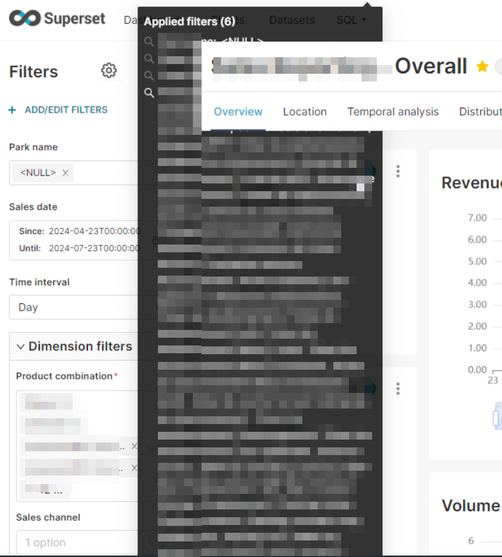
Hi Superset team,
I’d like to suggest an improvement to the user interface for list that appears after clicking the Applied filters button.
Current behavior: - The list appears partially beneath the top menu bar, which affects visibility and layout. - When many filters are applied, the list becomes very long and difficult to scroll or navigate. It currently doesn't support any scrolling mechanism, which limits usability.
Thanks you for your hard work :)
Comment From: msyavuz
Thanks for reporting this. I am bundling this change with some regressions on https://github.com/apache/superset/pull/34790