Screenshot
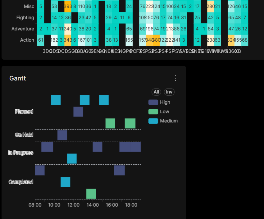
Description
When using the Gantt chart component in dark theme, the y-axis labels currently render with a white outline. On a dark background this makes them: - Harder to read - Visually straining on the eyes - Inconsistent with the style of other chart types in dark theme (where labels generally use more balanced colors and contrast)
It would be great if the y-axis label styling could be aligned with other charts in dark mode for better readability and consistency.
Comment From: msyavuz
Hey, nice catch! Do you intend to open a pr to fix this? I am happy to help review push it through if you decide to do so.