[SIP-185] Proposal for Chart Customization / Dynamic Group By in Dashboards
Motivation
There is a need to enhance dashboard interactivity by enabling users to dynamically change group by fields in charts directly from dashboards. This will allow end users greater flexibility in data exploration and reduce the need for creating multiple static charts for different group by dimensions.
Proposed Change
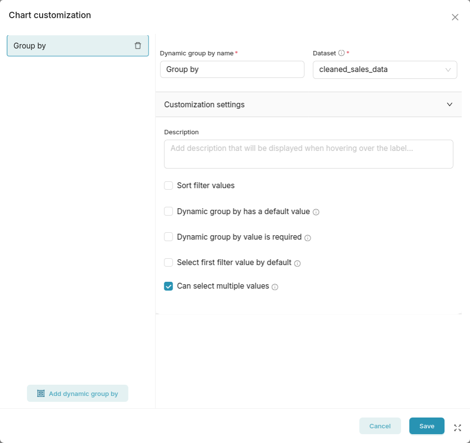
Introduce a feature that allows dashboard viewers to select and adjust the group by column(s) for charts in real time. This could involve UI changes to add group by selectors on charts, backend enhancements to support dynamic query generation, and state management for user selections. Reference implementation and early discussion can be found in PR #33831.
New or Changed Public Interfaces
- Changes to chart and dashboard React components to support group by selectors
- Updates to REST endpoints (if needed) to accept dynamic group by parameters
- Potential updates to chart metadata and dashboard state
New dependencies
No new dependencies
Migration Plan and Compatibility
- Ensure dashboards with static group bys continue to work as before
Rejected Alternatives
- Continue requiring users to create multiple charts for each group by scenario. This approach leads to dashboard clutter, increased maintenance overhead, and a less dynamic user experience. It also does not scale well when users want to explore multiple dimensions interactively.
Comment From: LevisNgigi
Thanks for this,I believe the feature is quite useful and will enable users to change dimensions at the dashboard level.
Comment From: geido
+1 for this!
Comment From: mistercrunch
This is great! +1 for sure. Quick questions:
- how do identify the "group by column" in various viz plugins? Without looking into the details, there's a variety of controls with different names and configurations for what is in theory the "primary dimension / group-by column" across visualizations. How does the feature know which control to force/override?
- Some viz plugins may allow for multiple group-bys (ie: country, state), but others only support single-value, how does the control behave? only single-selection?
- related to previous questions, but charts line the time-series may have both X-axis grouping and a
dimensionfield, how do we know which field to target? Seems in this particular case we should target dimension, but if a user hascountryon x-axis, guessing we still target thedimensionfield?
Comment From: msyavuz
Good questions, here's how it's handled in the referenced pr:
- The implementation directly sets groupby field in the formData bypassing control names
- There is actually a
chartTypeLimitations.tsfile that enforces limitations based on chart type. - Yes, for that case we always target dimension
Comment From: an3uryzm
I believe there is something wrong in the motivation of this feature.
Having a feeling that it tries to replace/reinvent cross filters and drill by's on dashboard-level, and exploration tool. Dynamic dimensions/dashboards are actually achieved with cross filters.
On the other hand there are indeed some cases (or better say - charts) where dynamic dimensions described here could be useful (table or pivot tables).
With other charts (line, bar) I think it will always be a pain when a user will accidently choose high cardinality column.
This would be a cool feature on the chart-level, not as global selectors on the dashboard-level
Comment From: LevisNgigi
This is great! +1 for sure. Quick questions:
- how do identify the "group by column" in various viz plugins? Without looking into the details, there's a variety of controls with different names and configurations for what is in theory the "primary dimension / group-by column" across visualizations. How does the feature know which control to force/override?
- Some viz plugins may allow for multiple group-bys (ie: country, state), but others only support single-value, how does the control behave? only single-selection?
- related to previous questions, but charts line the time-series may have both X-axis grouping and a
dimensionfield, how do we know which field to target? Seems in this particular case we should target dimension, but if a user hascountryon x-axis, guessing we still target thedimensionfield?
These are great questions and some had been discussed with the inputs of Sophie and Rebecca: 1) When a dashboard group by is applied, we look up the chart type and replace the correct form-data field (e.g. groupby, series, columns, source/target, etc.).
2) We follow the limits defined in chartTypeLimitations.ts: Charts in SINGLE_COLUMN_DIMENSION_CHARTS (like heatmap, waterfall) always get one column only. Most others accept an array of columns, so we simply inject the full array. A few special charts (graph, sankey, bubble) are capped at exactly two. limitColumnsForChartType enforces these rules.
3) For time-series (e.g., echarts_timeseries, echarts_area): If an X-axis is already set, new group-bys are written to the groupby/dimension field. so for these we target dimensions as Memo has pointed out above.
Comment From: msyavuz
@an3uryzm This feature isn't meant to replace cross-filters or drill-by, it serves a different use case. Cross-filters let users filter data based on selections, while this feature lets users change the actual grouping dimension without leaving the dashboard.
Think of it as "I want to see this same metric grouped by region instead of product" vs "I want to filter to only show data for region X".
Would love to hear more about your specific use cases. Perhaps we can ensure the implementation addresses them properly.
Comment From: an3uryzm
@msyavuz thank you for the answer!
Think of it as "I want to see this same metric grouped by region instead of product" vs "I want to filter to only show data for region X".
Use case: "I want to see this same metric grouped by region instead of product"
I would ask a user how he wants to see this metric (what chart type?)
Solutions:
№1 If line chart (read as I want to see this metric through time):
- Create one line chart for this metric
- Create another table chart with dimensions
- Add both charts to the dashboard and enable cross filter for both.
№2 If table chart (read as "I want to see this metric, calculated during specified time window I set at the global dashboard filter. Table should have default dimension and I want to change it dynamically using global filters):
Comment From: msyavuz
@an3uryzm I agree that there are solutions but this SIP and implementation we have is attempting to better the flow you mentioned:
№1 If line chart (read as I want to see this metric through time): 1. Create one line chart for this metric 2. Create another table chart with dimensions 3. Add both charts to the dashboard and enable cross filter for both.
If you want to do this very frequently and without duplicating the line chart and table chart in the dashboard every time, having a dynamic groupby setting is very handy and much better user experience don't you think?
Comment From: an3uryzm
@msyavuz
You never need to duplicate line chart, that was my point.
Imagine you have dashboard with 2 charts: 1. Line chart with metric Revenue 2. Table chart with Dimension Country and metric Revenue.
User wants to see trends of the revenue for the specific country -> he just clicks on the country and line chart cross filtered. User wants to see trends of the revenue for another dimensions, suppose Category -> you add new chart to the dashboard with that dimensions and line chart cross filtered on click the same way. I believe this is natural way of using Superset, it was designed that way (please correct me if I am wrong)
With this SIP you introduce manipulation of dimensions in the line chart also. If a user choose 2 dimensions with this feature, line chart's metric Revenue wil be "break downed" into lot of Revenue metrics per X-axis, which is [number of Countries] * [number of Categories]. I have never met cases where user wants to break down a metric on the line chart into many dimensions.
Comment From: msyavuz
@an3uryzm Thanks for elaborating on your concerns. I understand your point about cross-filtering being the "natural way" in Superset, and you're right that it's a powerful existing feature. However:
### 1. Different Use Cases
This feature addresses a specific pain point: users who need to quickly pivot their analysis dimension without creating multiple charts. For example, a sales dashboard where users frequently want to switch between viewing metrics by: - Product category - Region - Sales rep - Time period - Customer segment
Creating 5+ table charts for cross-filtering becomes unwieldy and clutters the dashboard.
### 2. Complementary, Not Replacement
This feature complements cross-filters rather than replacing them. The key is giving dashboard designers the choice. Some dashboards benefit from cross-filter patterns, others from dynamic dimensions.
Comment From: yousoph
hi @an3uryzm!
One thing that is included in the initial implementation is when setting up the group by, there is the ability to allow multiple selections. If that's not allowed, the user will only be able to select one dimension at a time.
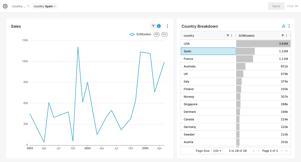
You're right that you can use cross filtering to see how a metric is broken down by different dimensions, but the resulting chart is not exactly the same thing as what you would be able to achieve with a group by field. I used your example to create a quick dashboard.
Here's total sales + a country breakdown, with a cross filter applied for Spain:
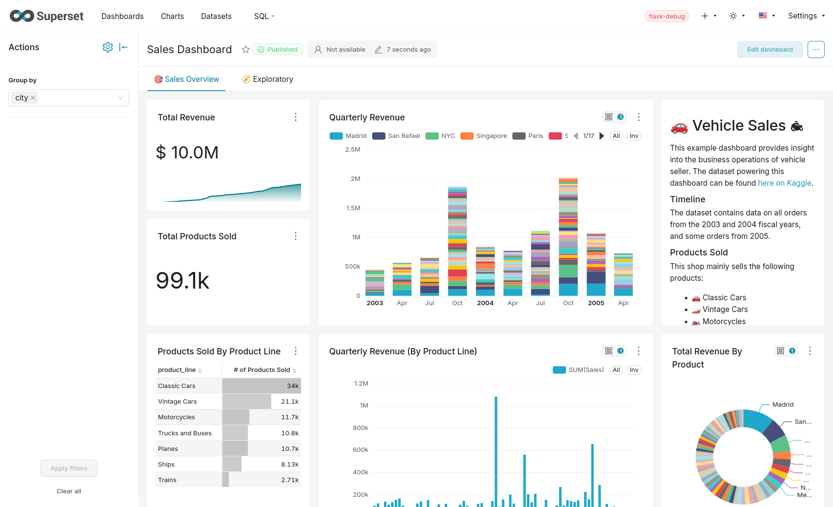
Here's what the same total sales line chart looks like when a group by country is applied:
+1 to @msyavuz 's point about this being an additional feature - it would be completely optional to add a dynamic group by to the filter bar and the cross filtering functionality still can be used if that's preferred!
Comment From: yousoph
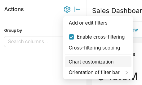
Some potential improvements to the initial implementation that could help with clarity: * Rename the section from "Chart customization" to "Group by" or "Dynamic group by" * Show the group by as a new filter type (in the dropdown with Value, Time range, Time grain, etc filter types) so that the Group by can be more easily re-arranged in the filter bar based on what the dashboard creator wants
Comment From: an3uryzm
@yousoph Thank you yousoph!
It looks like this SIP simplifies another way of doing the same thing, which is this https://docs.preset.io/docs/using-jinja-to-manipulate-the-aggregated-column-used-on-a-chart EDIT: and adding possibility to multiple group bys (which is impossible/or not simple to do with jinja)
Am I correct ?
Comment From: yousoph
Yes @an3uryzm, I believe that's correct
Comment From: rusackas
I'm late to the party, but I have some questions before I cast my vote :)
- In the "Chart Customization" modal, do we expect to carry over other things BESIDE the "groupby" options?
- Does the term "Chart Customization" sound like it's customizing the chart? Might be confusing - we already have the Chart Properties modal for that.
- Is there any reason not to change "Add or edit filters" to be "Manage filters and groupings" and just add this into the filter modal (to be renamed) alongside scoping as a new tab OR just let it live in the list of other filters? It kind of makes sense to me to have filters and group-bys managed in the same spot, especially when the UI is strikingly similar.
- If this IS going to be a modal of its own, Just wondering what the code footprint is here... hopefully it can be pretty DRY/minimal and recycle existing stuff.
Comment From: villebro
I didn't see if this was mentioned anywhere, but Superset actually had an experimental native filter precisely for this purpose, but which was later removed due to poor maintenance. See the PR from 5 years ago that added this: #14217 .
One issue that comes to mind for me is security implications of being able to add granularity to charts. There may be situations where a dashboard shows highly aggregated data that's referenced from tables containing sensitive data that should only be aggregated to a certain level. Providing an option to dynamically group data further could lead to situations where the data that's displayed is so granular that it singles out data that should not have been possible.
Not necessarily a blocker, but I think it could at a minimum be a good idea to be able to specify which columns are allowed for grouping, especially for very wide tables where there's only a few columns that are relevant for dashboard consumers.